


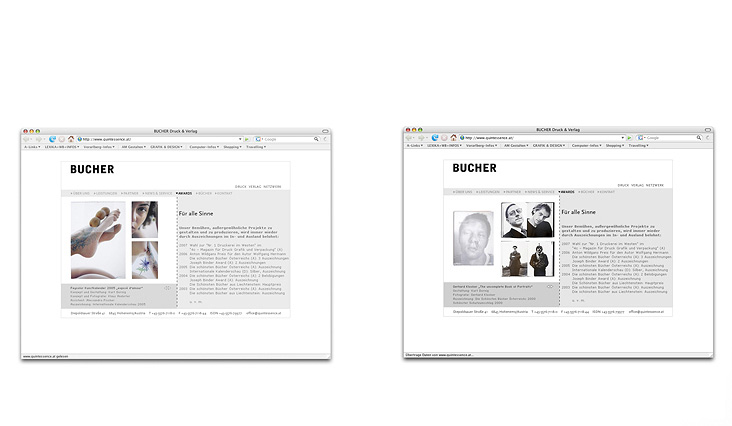
Corporate design “BUCHER Druck Verlag Netzwerk”
It rests upon two main components: The powerful logotype and the lizard, which is employed as a noticeable, flexible element.
Corporate design “BUCHER Druck Verlag Netzwerk”
The basic business stationery is designed in black and white. Earth tones have been chosen for printed material that initiates direct contact with clients (newsletters, publishing programs, gift packaging etc.).
The restricted use of colors and graphics to leave room for what is essential, and the application of refined printing technology (e.g. translucent hot foil stamping for the business cards) emphasize the high standards in terms of design and quality and make BUCHER stand out clearly from the competition.